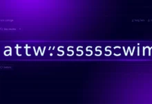
A text shadow generator builds the CSS text-shadow value that places a shadow behind text, and shows you the result as you adjust it. The tool below lets you set the horizontal and vertical offset, the blur, the color, and the opacity, then gives you the exact text-shadow line to paste into your stylesheet. Everything is computed in your browser.
What the CSS text-shadow Property Is
The text-shadow property adds one or more shadows to the text of an element. Each shadow is drawn behind the characters and is described by up to three length values and a color: how far the shadow sits to the side, how far it sits up or down, and how soft its edge is. Unlike box-shadow, which shadows the rectangular box, text-shadow follows the shape of the letters themselves. It applies to the text of the element it is set on and is inherited by child elements.
How to Use This Generator
- Drag the horizontal offset to move the shadow left or right of the text.
- Drag the vertical offset to move the shadow up or down.
- Set the blur radius. Zero gives a sharp copy of the text; higher values spread and soften it.
- Pick the shadow color and set the opacity to control how strong it looks.
- Watch the live preview, then copy the generated text-shadow line into the CSS rule for your text.
The text-shadow Syntax
offset-x is the horizontal distance; a positive value moves the shadow right, a negative value moves it left. offset-y is the vertical distance; positive moves it down, negative moves it up. blur is the blur radius; larger values make a softer, wider shadow, and it cannot be negative. color is the shadow color, here written as rgba() so opacity is included.
Common text-shadow Values
| Effect | text-shadow value |
|---|---|
| Subtle drop shadow | 2px 2px 4px rgba(0, 0, 0, 0.5) |
| Hard offset shadow | 3px 3px 0px rgba(0, 0, 0, 1) |
| Soft glow | 0px 0px 12px rgba(0, 150, 255, 0.8) |
| Lifted text | 0px -2px 3px rgba(0, 0, 0, 0.4) |
| No shadow | none |
Layering Multiple Text Shadows
You can apply several shadows to the same text by separating each shadow with a comma. The shadows stack from front to back in the order written, so the first one sits closest to the text. This is how a glow or an outline is built: a glow repeats the same soft shadow with a larger blur, while an outline sets four hard shadows at one pixel up, down, left, and right with no blur. For example, text-shadow: 1px 1px 0 #000, -1px -1px 0 #000, 1px -1px 0 #000, -1px 1px 0 #000; draws a one pixel black outline around the letters.
Readability and Accessibility
A text shadow can help text stand out over a busy background, but it can also reduce legibility if it is too strong. Keep the offset and blur small for body text, and reserve heavier shadows for large headings. A shadow does not change the contrast ratio between the text and its background that accessibility checks measure, so it is not a substitute for choosing readable colors. Test the result at the actual size the text will be read.
When to Use It
Use text-shadow when text sits over an image or gradient and needs separation from the background, when a heading should read as raised or pressed, or when you want a glow or outline effect that follows the letter shapes. For shadows on boxes, buttons, and cards, use the box-shadow property instead, since text-shadow only affects the characters of the text.
Last Thoughts on Generating Text Shadows
A text shadow is four decisions: how far across, how far down, how soft, and what color. Adjusting those numbers by hand and reloading is slow, which is why a live preview helps you settle on a value in seconds rather than guessing in a stylesheet. Once the preview looks right, the generated line is all you copy.
Set your shadow above and paste the result into your CSS. For shadows on boxes rather than text, use the box shadow generator, build a background with the CSS gradient generator, and pick your shadow color with the color picker. Explore the rest of our free online tools.
Key Takeaways:
- The text-shadow value is offset-x, offset-y, blur, and color, in that order.
- Positive offsets move the shadow right and down; negative offsets move it left and up.
- The blur radius softens and spreads the shadow; zero gives a sharp copy of the text.
- Writing the color as rgba() lets you set opacity directly in the value.
- Separate multiple shadows with commas to build glow and outline effects.
- Keep shadows light for body text so legibility is not reduced.
Frequently Asked Questions (FAQs)
What does the text-shadow property do?
It draws a shadow behind the text of an element. The shadow follows the shape of the letters rather than the box, and you control how far it sits to the side, how far up or down, how soft its edge is, and what color it is.


What is the order of the text-shadow values?
The order is offset-x, offset-y, blur, then color. The first two numbers are the horizontal and vertical offset, the third is the blur radius, and the color comes last. The blur value is optional and defaults to zero if omitted.
How do I add multiple text shadows?
Separate each shadow with a comma. The shadows stack in the order written, with the first sitting closest to the text. This is how layered effects such as a glow or a letter outline are built from several simple shadows.
How do I create a glow effect with text-shadow?
Set both offsets to zero and use a larger blur with a bright color, for example 0 0 12px rgba(0, 150, 255, 0.8). Repeating the same shadow two or three times with increasing blur makes the glow stronger and wider.
What is the difference between text-shadow and box-shadow?
text-shadow shadows the characters of the text and follows their shape, while box-shadow shadows the rectangular box of the element. Use text-shadow for headings and labels, and box-shadow for cards, buttons, and other boxes.
Does this generator send my data anywhere?
No. The preview and the generated CSS are produced entirely in your browser as you move the controls. Nothing you set is uploaded, logged, or stored on any server.